The Challenge
The non-profit organization, Map Your World, had a mission to bring the accuracy of GPS data to visualizing and then solving social problems. They had proven this technique effective with a few youth groups in India, the Philippines, and California. However, because the website was hard to use, it required a great deal of oversight, which was not scalable. They hired Favorite Medium to help them iterate their application.
The Process
In a series of work sessions, I worked with the technical PM and ECD to help the client define their requirements. Digging deeper, we needed to understand what the process for the application was and needed to be. Additionally, I did an evaluation of the application to uncover usability issues.

The Insight
Our clients wanted the youth participating on the site to understand that Map Your World is a process that starts with collecting and visualizing data to use to fight for social change. However, their website overwhelmed users by presenting everything at once with no guidance of where to start. Furthermore, the graphics, while trying to appeal to a younger audience, actually worked to distract users.
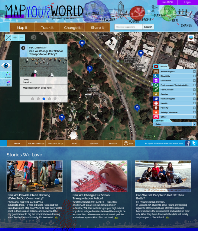 |
| Original homepage concept had no clarity in the purpose of the site or how to use it. |
The Solution
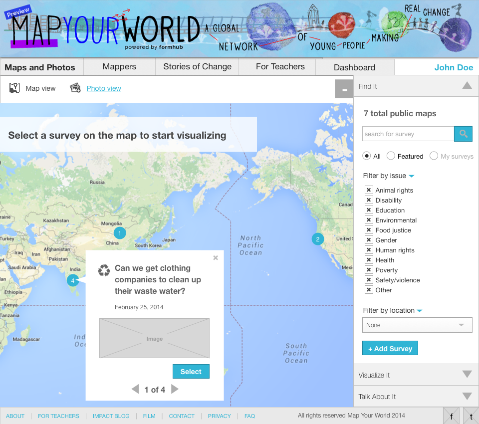
Starting the the map page (the key tool of the site), I created wireframes that simplified the UI for mapping. By using accordions that specified the key steps of the process, users had a clear sense of where to start and what they needed to do. People new to the site could be inspired by what others have done, but not overwhelmed.
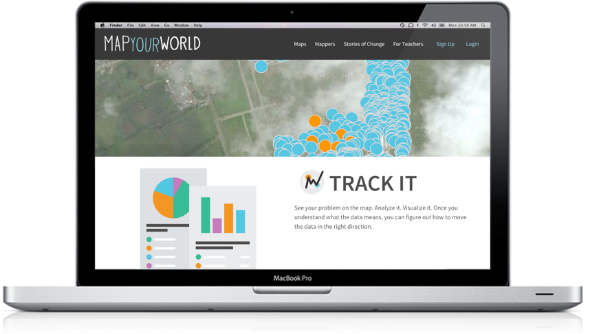
Next, I designed a new home page that clearly stepped users through the discrete parts of the process. While our wireframes allowed for more content, I worked with our ECD and the client to come up with content that was inspiring and descriptive, yet concise and clear.
