|
| Final visual design by Jay Bernasconi |
Northwestern Mutual built their previous site around business goals that, while clear to the organization, confused consumers, making it difficult to find information relevant to their needs. Therefore, Northwestern Mutual asked us to provide a user-centered approach to streamline the content and the architecture for the site. We provided a cohesive and comprehensive content strategy to achieve these business goals in an improved information architecture and creative design.
Personas
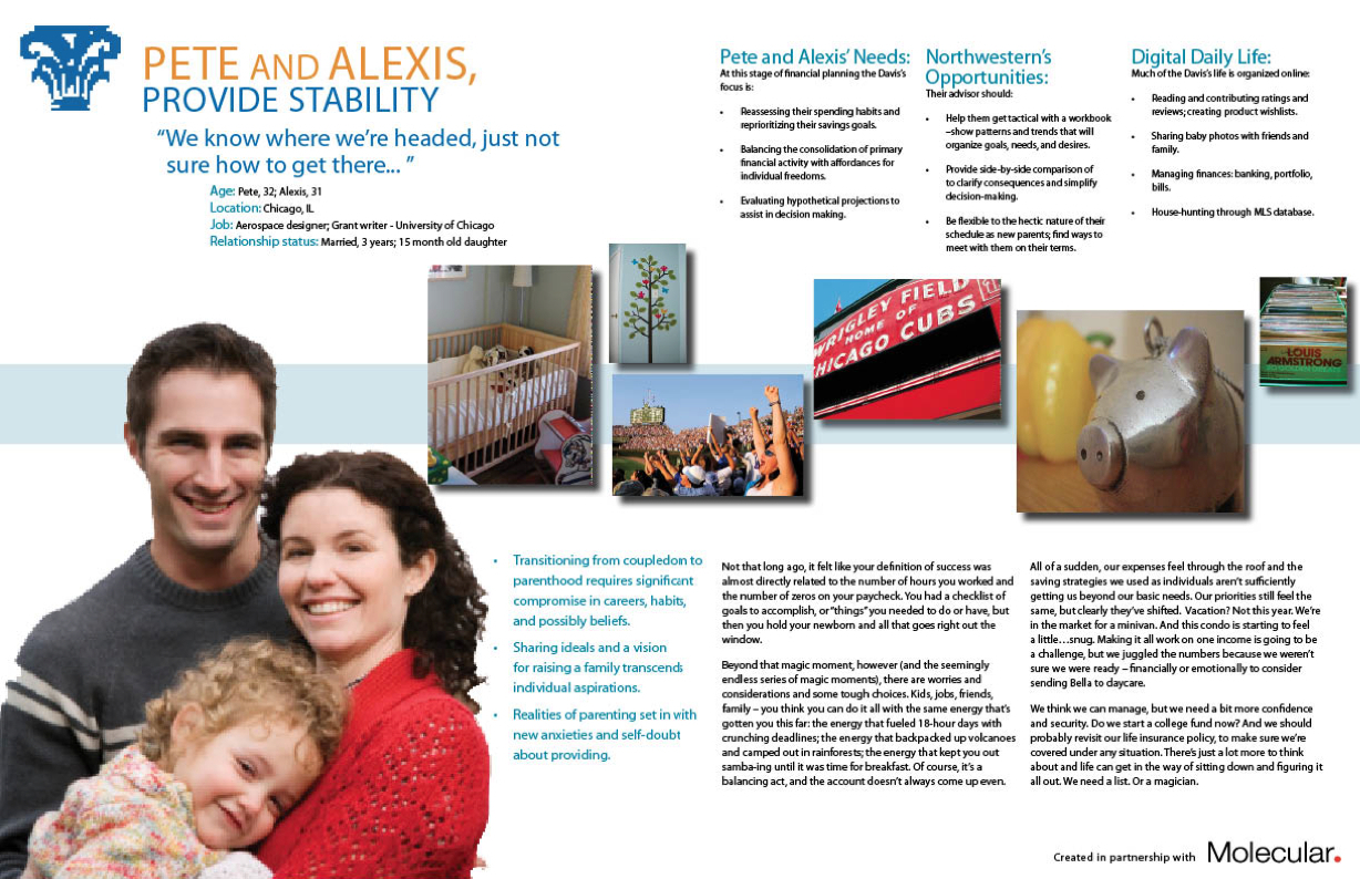
We combed through qualitative brand and consumer research provided by Northwestern Mutual to create a basic skeleton to the persona framework. On top of the skeleton we added life to the personas by pulling pertinent quotes, adding stock photography and lifestyle images, and creating stories around them. While personas are typically constructed from extensive quantitative data, this approach created personas that resonated with what the client already knew about their consumers, while adding important insights about consumer needs and digital behaviors.
Sitemap

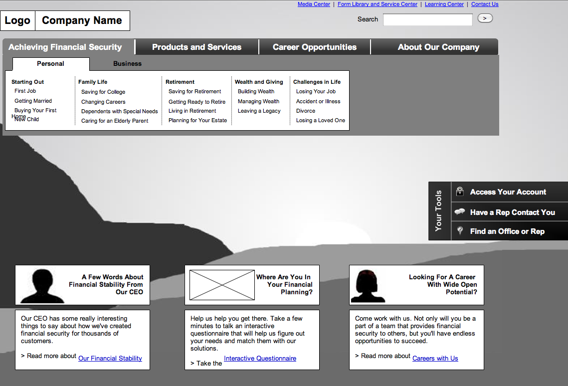
The goals of this project included reducing the number of pages on their site by 30% to streamline the user experience. Through an analysis of their current content, we found significant redundancies - because the business units didn't know where consumers would look for content, they put it in multiple places. We presented the new architecture to the clients with persona overlays that highlighted where content would go based on consumer expectations.

Wireframes
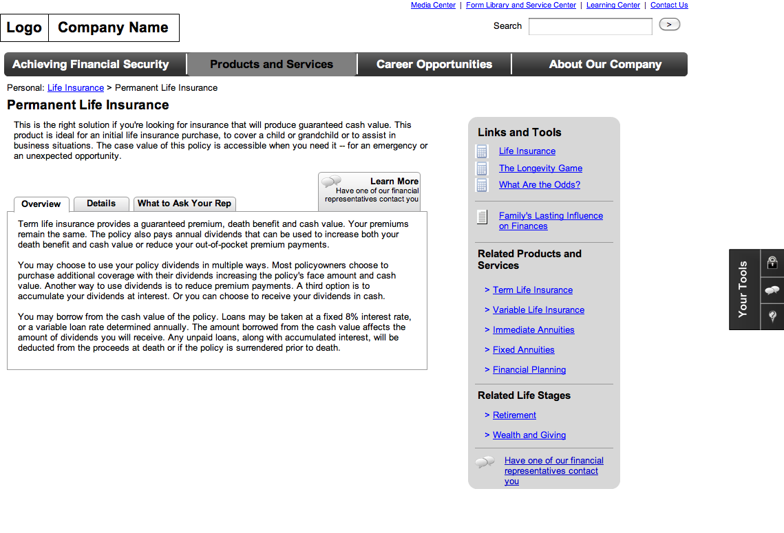
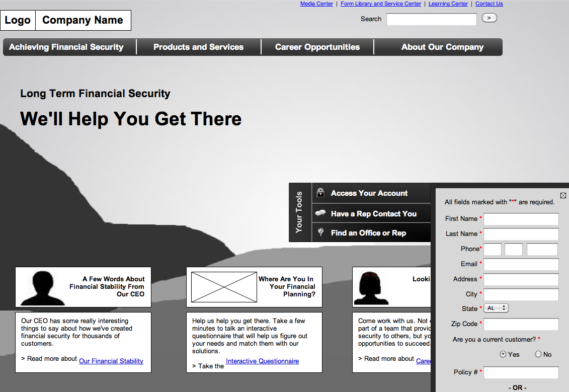
The business goals of the site consisted of generating qualified leads. To do this, we organized content in the narrative order a user expects, starting with an overview, diving into more information, and then offering the contact form as the final call to action.
Usability Testing
Our designs broke from some conventional interaction patterns, so we wanted to test. We used a highly interactive clickable prototype I developed in Axure, supplementing some of the less interactive experiences with paper prototypes. As a result of the testing, we identified a few key layout and functionality issues that we quickly remedied before moving on to visual design.