 |
| Final visual design by Jon Reil, Amanda Talbott, and Michael Sui |
Nokia came to us to help them market their solutions-based approach to consumers. However, they were competing with a mental model set up by Apple in which phones come with music, navigation, and other capabilities standard. Therefore, our design had to help explain this strategy - "Connecting People" through integrated services that consumers could purchase - localized for language and sales needs for nearly 50 countries.
I lead a highly collaborative design process, engaging both the five members of my team and upwards of ten people on the client team within an agile development process.
Persona Booklet

Nokia tailors their product solutions to a certain persona, so we designed the web pages that explain those products to appeal to that specific group. In short, every aspect of these pages, from the colors, to the tone, to the organization of the information, differ based on what we know about that group. For the persona booklet, we incorporated client data in an easily consumable format adding a layer of context and pragmatic brainstorming to bridge all three parts of the sales and ownership lifecycle.
These six personas then informed every step of our design process.
Mood Boards
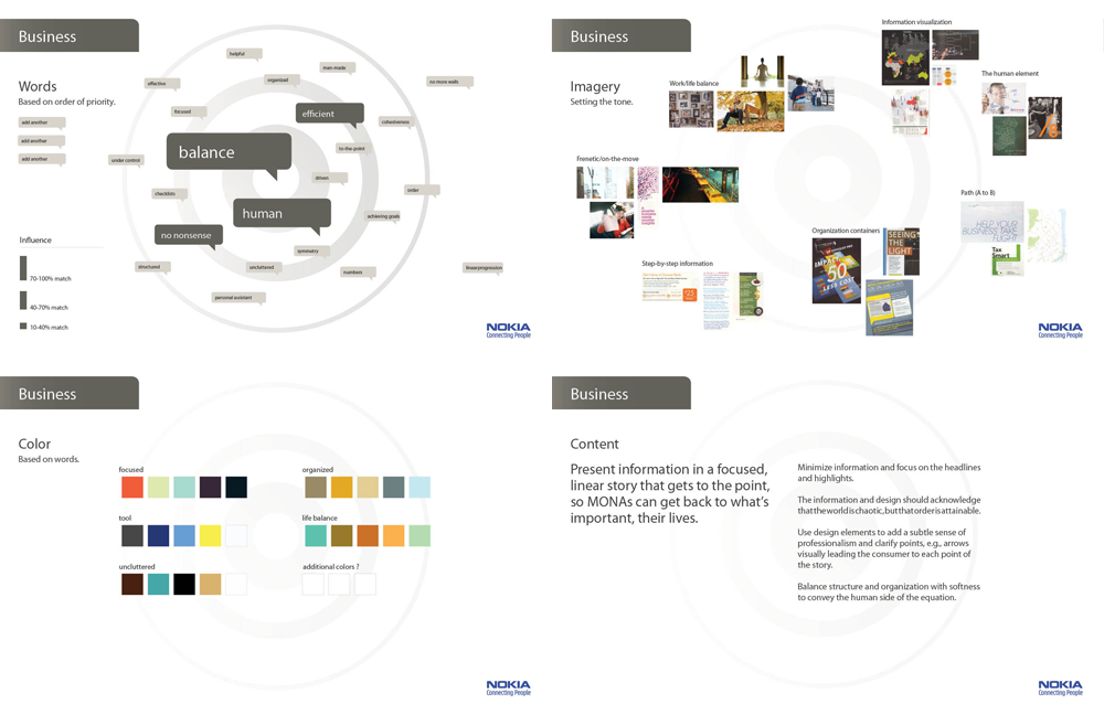
To better communicate to the client and our design team the specific goals for each page, we created mood boards for each product group, linked to specific personas. We explored the kinds of key words, color palettes, photography style, and presentation of content that would resonate with the specific audience.
User Flows
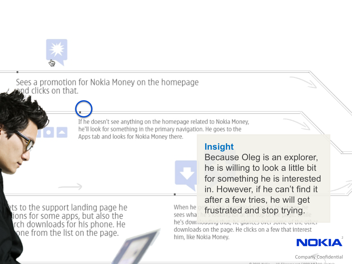
We created user flows to assess the appeal of information, locations for content discovery, and relevance of information. These were presented as animated PowerPoint presentations where we could actually move through the flow, highlighting insights within context. These served as effective means for quickly planning for the information architecture and content needs.
Wireframes
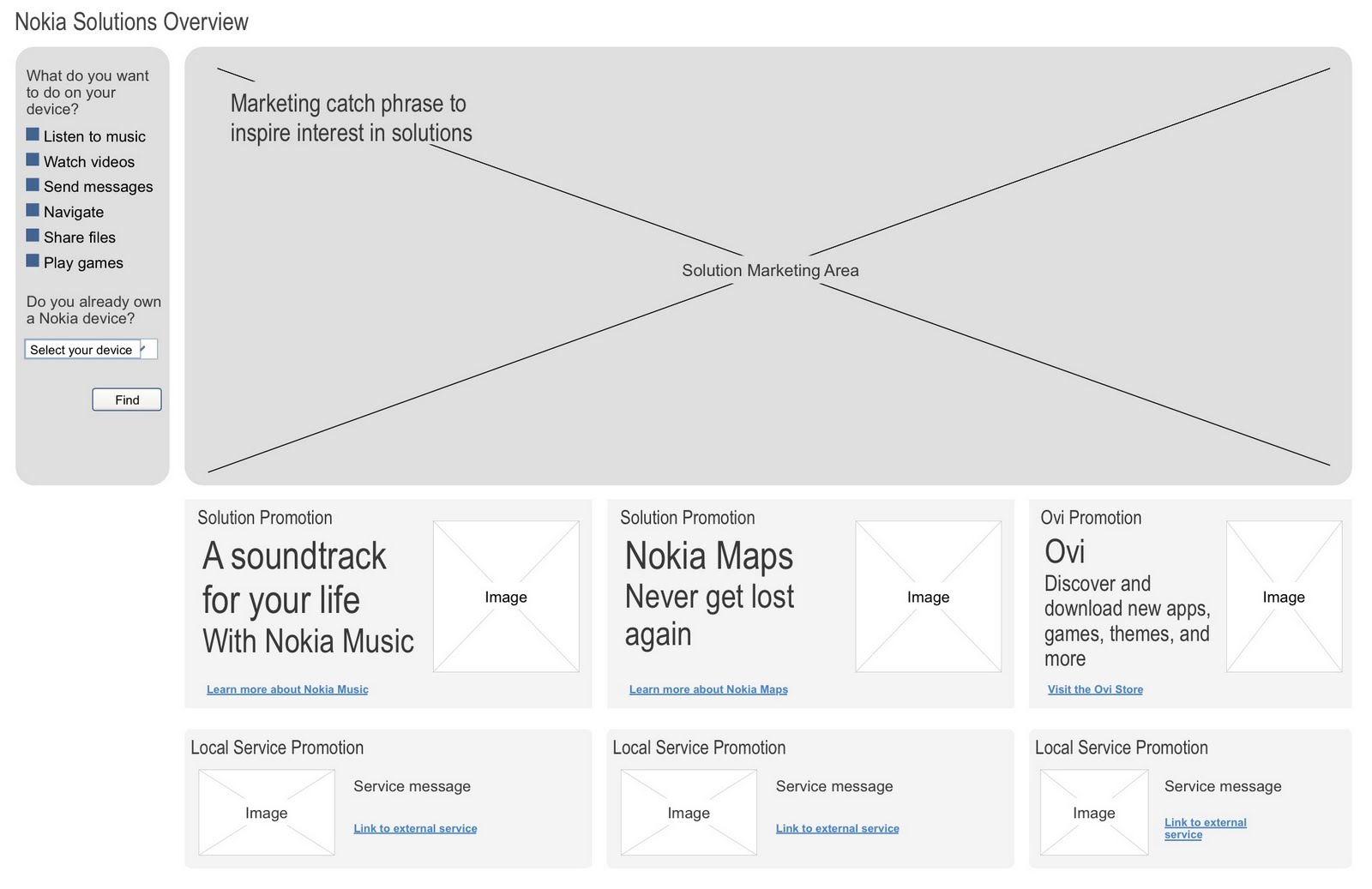
We all understood that consumers didn't go to Nokia.com for "solutions" - they go to find a phone. Through wireframes, we organized the content to provide contextual explanations. Knowing that users look at phones first, we wanted to allow users to discover the phone they wanted, then dive into detailed information about services and features when they were further along the purchase funnel.
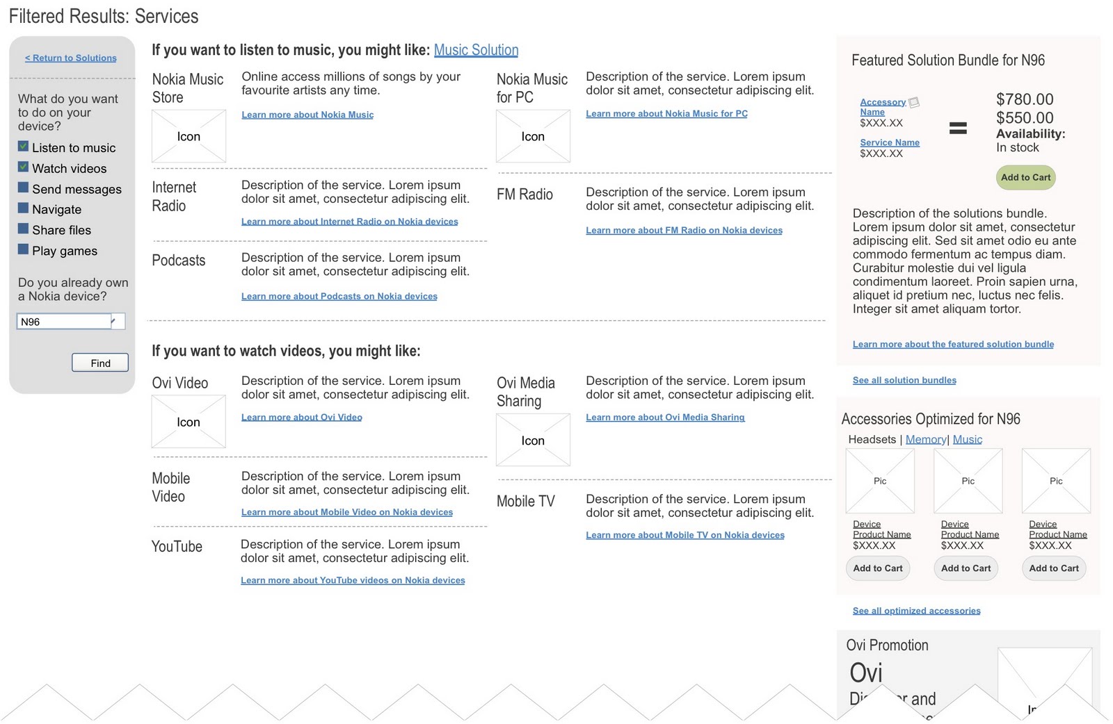 |
| Filtered service results showing tailored solutions. |
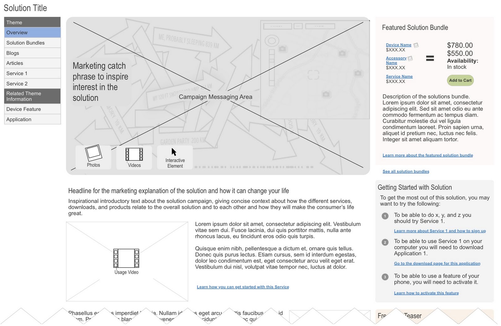 |
| Marketing page for solutions. |
 |
| Service page. |
 |
| Other features. |
Content Strategy
The final part of the work we did for Nokia consisted of content guidance. Again, we wanted to show the consumer what they wanted first - a phone. Then, as the user scrolls down the page, services and accessories are discovered in the context of the phone (e.g., images of the service on the screens or of someone using the service in the real world). Furthermore, we were able to leverage the personas to create completely different looks for each solution and organize the content in ways most relevant to the persona.
 |
| Content and design based on business persona. |