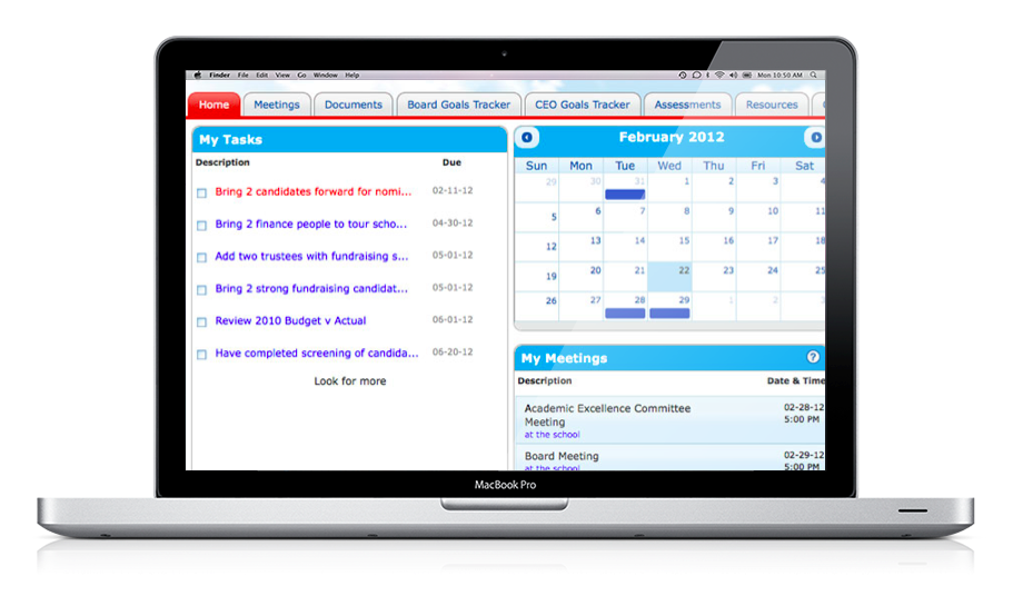
This provider of efficiency tools to charter school boards asked me to evaluate the usability of the tool, Board on Track, and make design suggestions.
Visual Design Testing

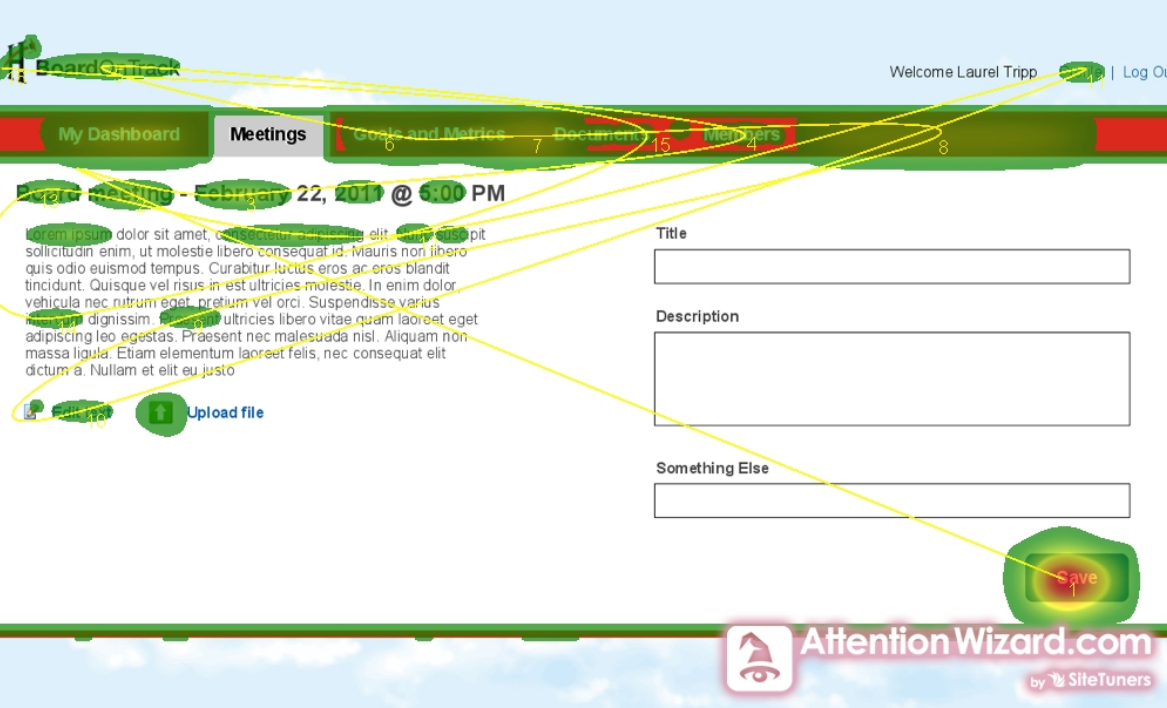
Two main problems plagued the original design of the application: visual hierarchy and contrast between elements. To illustrate the extent of these interrelated problems I used Attention Wizard and Colour Contrast Check. As a result of low contrast and overuse of elements, navigation and buttons corresponding to key tasks became extremely hard to locate. To fix this from a visual design perspective, I made a number of recommendations which I then tested in a quick mock up:
- Increase the contrast for buttons and navigation in the color scheme.
- Change the background from the sky image to white.
- Create a set of icons for secondary tasks and reserve a high contrast button for the primary task on the page.
- Use a layout that for tasks that takes advantage of typical user reading behavior (see more about this in the next section).
Interaction Strategy
Feedback from users revealed that most were unsure how to start major tasks. Controls and navigation were mixed together with no sense of priority. This made it hard to figure out where you were and what you should do next. A key design insight came from users who said that the Summary View which showed the agenda in a table format made more sense to them. Therefore, I designed the data entry interface with these design principles in mind: prioritize, create hierarchy, and use establish interaction models. This streamlined the interface and helped focus the user on the task at hand.
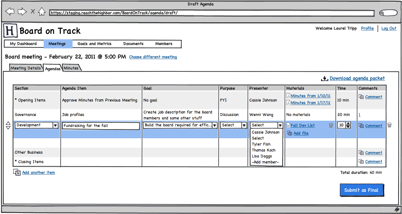
Wireframes
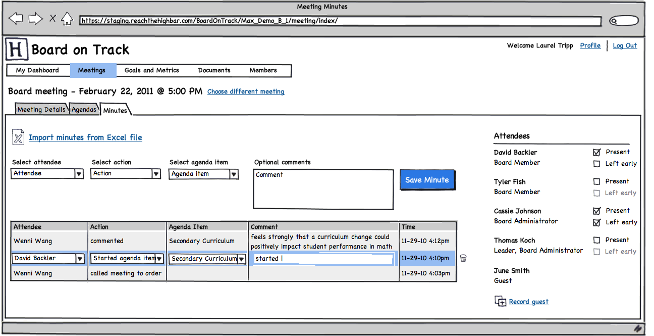 |
| Meeting minutes interface. |
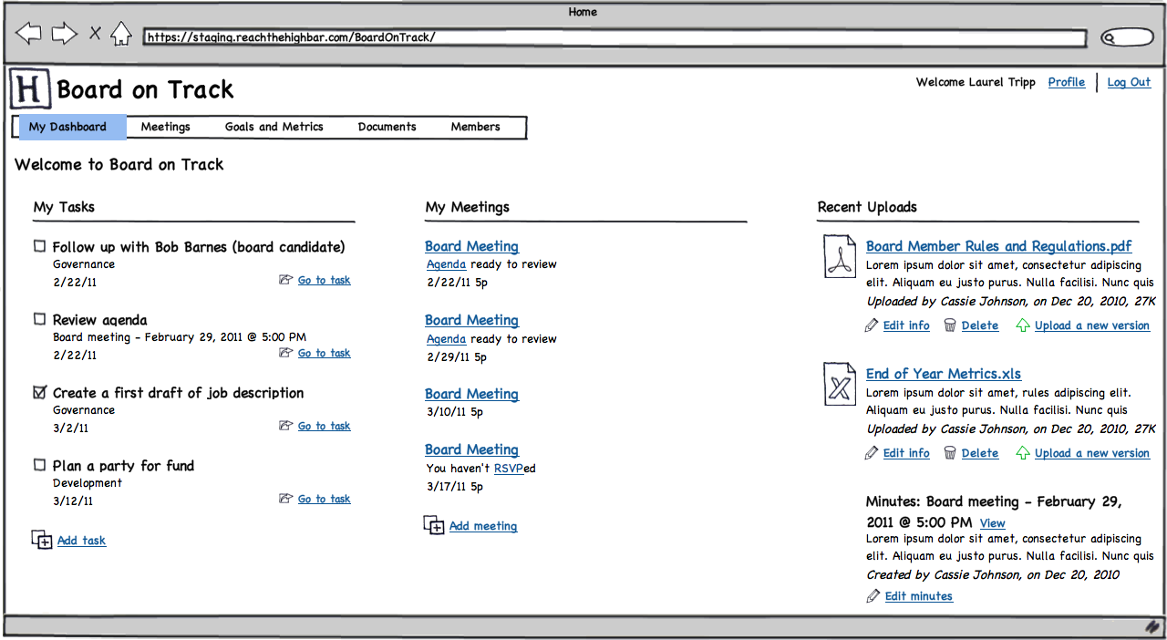 |
| Streamlined dashboard. |
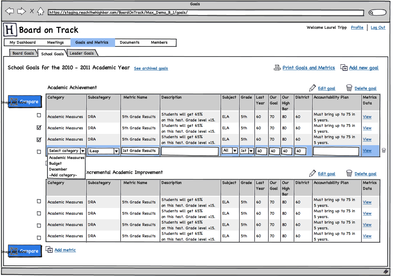 |
| Goal tracking interface. |
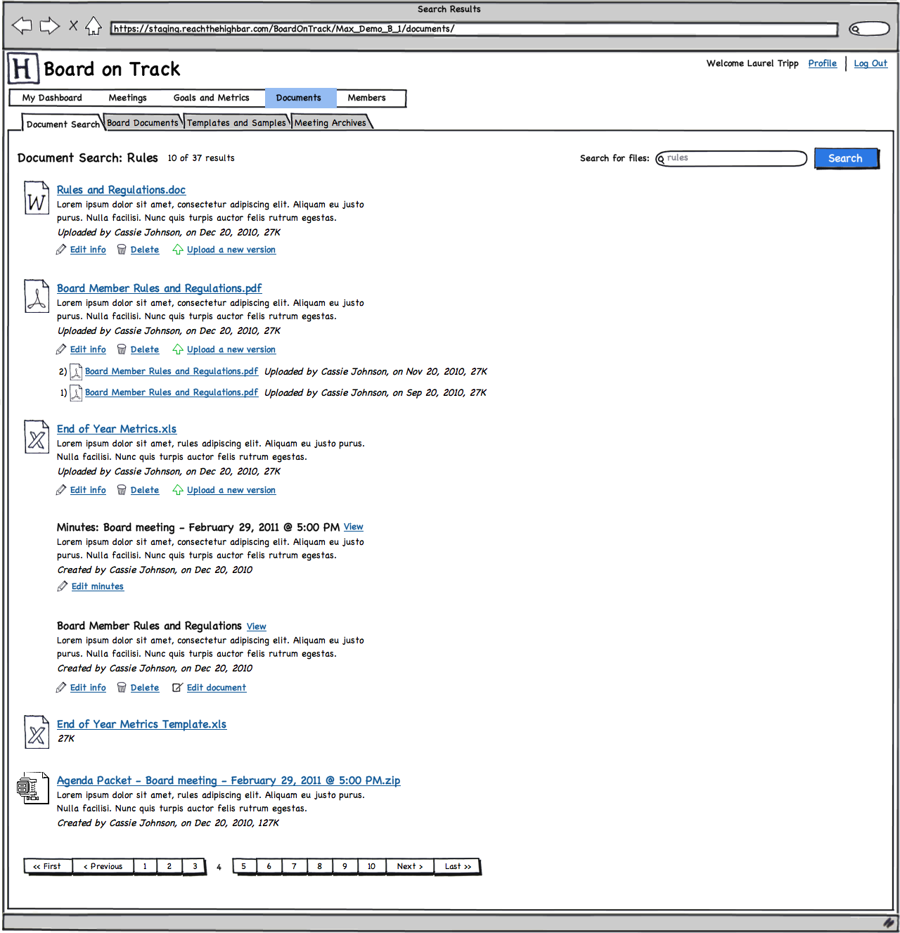 |
| Document search. |